backgroundColor: value >20000?'rgb(255, 211, 35)':'',
47
color: value >20000?'#000':'',
48
},
49
}),
50
aggregators: {
51
sum: commonAggregators.sum,
52
avg: commonAggregators.avg,
53
min: commonAggregators.min,
54
max: commonAggregators.max,
55
},
56
},
57
{
58
name:'Spend Change %',
59
prop:'Spend Change (%)',
60
sortable:true,
61
filter: ['number'],
62
columnType:'percent',
63
cellTemplate: changeRenderer,
64
},
65
{
66
name:'Avg Rating',
67
prop:'Average Rating',
68
filter: ['number', 'slider'],
69
sortable:true,
70
maxStars:5,
71
maxValue:5,
72
thresholds: [
73
{ value:4, className:'high' },
74
{ value:3, className:'medium' },
75
{ value:2, className:'low' },
76
],
77
cellParser: (model, column) => {
78
constvalue= model[column.prop];
79
if (Number(value)) {
80
return value.toFixed(2);
81
}
82
return value;
83
},
84
cellTemplate(...args) {
85
constcolumn:PivotConfigDimension= args[1].column;
86
if (column.dimension ==='values') {
87
switch (column.aggregator) {
88
case'star':
89
returnratingStarRenderer(...args);
90
case'prg':
91
returnprogressLineWithValueRenderer(...args);
92
}
93
}
94
return args[1].value;
95
},
96
aggregators: {
97
prg: commonAggregators.avg,
98
star: commonAggregators.avg,
99
},
100
},
101
{
102
prop:'Discount Applied',
103
sortable:true,
104
filter: ['selection'],
105
},
106
],
107
rows: ['City', 'Age'],
108
columns: ['Gender'],
109
values: [
110
{
111
prop:'Total Spend',
112
aggregator:'sum',
113
},
114
{
115
prop:'Average Rating',
116
aggregator:'prg',
117
},
118
],
119
hasConfigurator:true,
120
flatHeaders:false,
121
};
1
[{
2
"Customer ID":"101",
3
"Gender":"Female",
4
"Age":"29",
5
"City":"New York",
6
"Membership Type":"Gold",
7
"Total Spend":"1120.2",
8
"Items Purchased":"14",
9
"Average Rating":"4.6",
10
"Discount Applied":"True",
11
"Days Since Last Purchase":"25",
12
"Satisfaction Level":"Satisfied",
13
"Spend Change (%)":"12.020000000000005",
14
"Savings":"112.02000000000001",
15
"Items per Purchase":"0.5384615384615384",
16
"Lifetime Value":"1680.3000000000002"
17
}, ...]
With a wide range of configuration options,
it allows dynamic handling of data fields across rows, columns, and summary areas, all tailored to fit specific business needs.
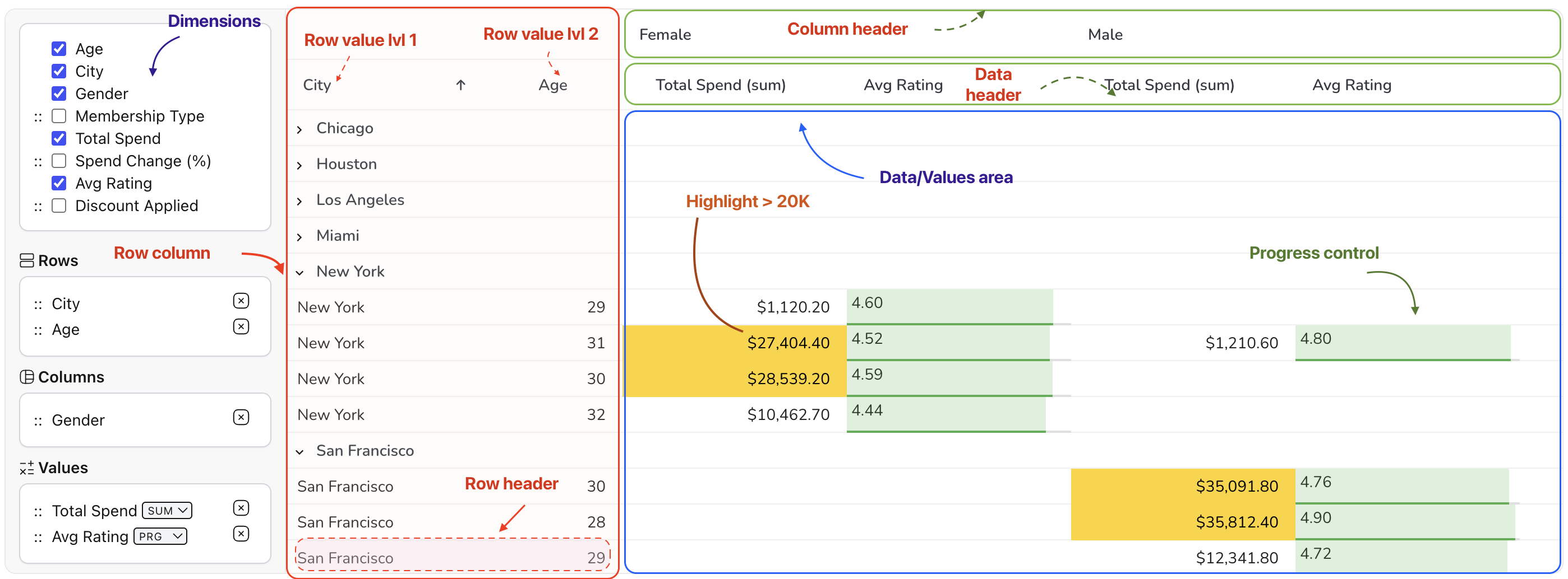
Below is a pivot table element map.
It may be helpful as you begin learning the capabilities of the Pivot Table component.
Perfect for applications requiring complex data analysis,
this plugin ensures flexibility and control while maintaining high performance.
Pivot Table Features
Key Features
Dynamic Pivoting: Easily switch between a standard grid and pivot mode for flexible data analysis.
Custom Aggregation: Apply built-in or custom aggregation functions to summarize data effectively.
Interactive Field Management: Drag and drop dimensions, rows, columns, and values with the configurator.
Custom Cell Rendering: Use custom renderers for displaying more interactive data, such as progress bars or star ratings.
i18n Support: Seamlessly integrate with different languages using built-in i18n configurations.
Real-time Sorting and Filtering: Enable users to filter and sort data dynamically for enhanced decision-making.
This is a concise example demonstrating the integration and configuration of the Pivot Table plugin, including the setup of dimensions, rows, columns, and value aggregators.
1
import { PivotPlugin, commonAggregators, type PivotConfig } from'@revolist/revogrid-pro';
// Add the pivot configuration to the additionalData
22
grid.additionalData = { pivot };
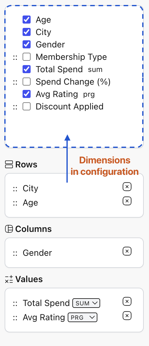
Dimensions
Dimensions are the fields or properties that define the structure of the pivot grid, providing the basis for organizing and aggregating data across rows, columns, and values.
Dimensions allow users to segment data by categories or attributes, such as Age, City, or Gender, which can be placed in the respective areas (rows, columns) of the pivot grid.
Each dimension can have its own specific configuration, including filters, sorting options, custom aggregators, and display formatting.
You can drag and drop dimensions into the appropriate areas to define the structure of the pivot grid in Configurator.
Additionally, dimensions may include options like hierarchical structures (for nested data), making it easy to drill down into more granular levels. By defining the dimensions, users gain control over how data is displayed and analyzed in the pivot grid, enabling more effective and tailored reporting.
Technically, dimensions are instances of ColumnRegular,
which means they are regular columns that can be used in the grid. You can configure them just like any other column: set name, template, size, and more.
1
import { PivotPlugin, commonAggregators, type PivotConfig } from'@revolist/revogrid-pro';
2
//...
3
{
4
dimensions: [{
5
prop:'Total Spend',
6
sortable:true,
7
columnType:'currency',
8
filter: ['number'],
9
cellProperties: ({ value }) => ({
10
class: {
11
highlight: value >20000,
12
'align-right':true,
13
},
14
}),
15
aggregators: {
16
sum: commonAggregators.sum,
17
avg: commonAggregators.avg,
18
min: commonAggregators.min,
19
max: commonAggregators.max,
20
},
21
}]
22
}
23
//...
Pivot Columns
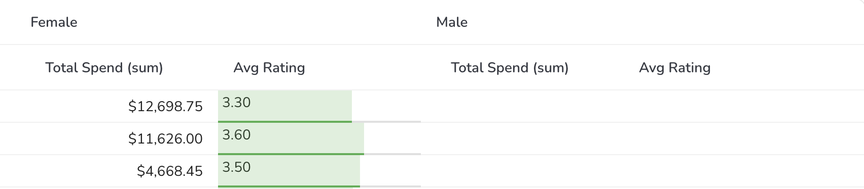
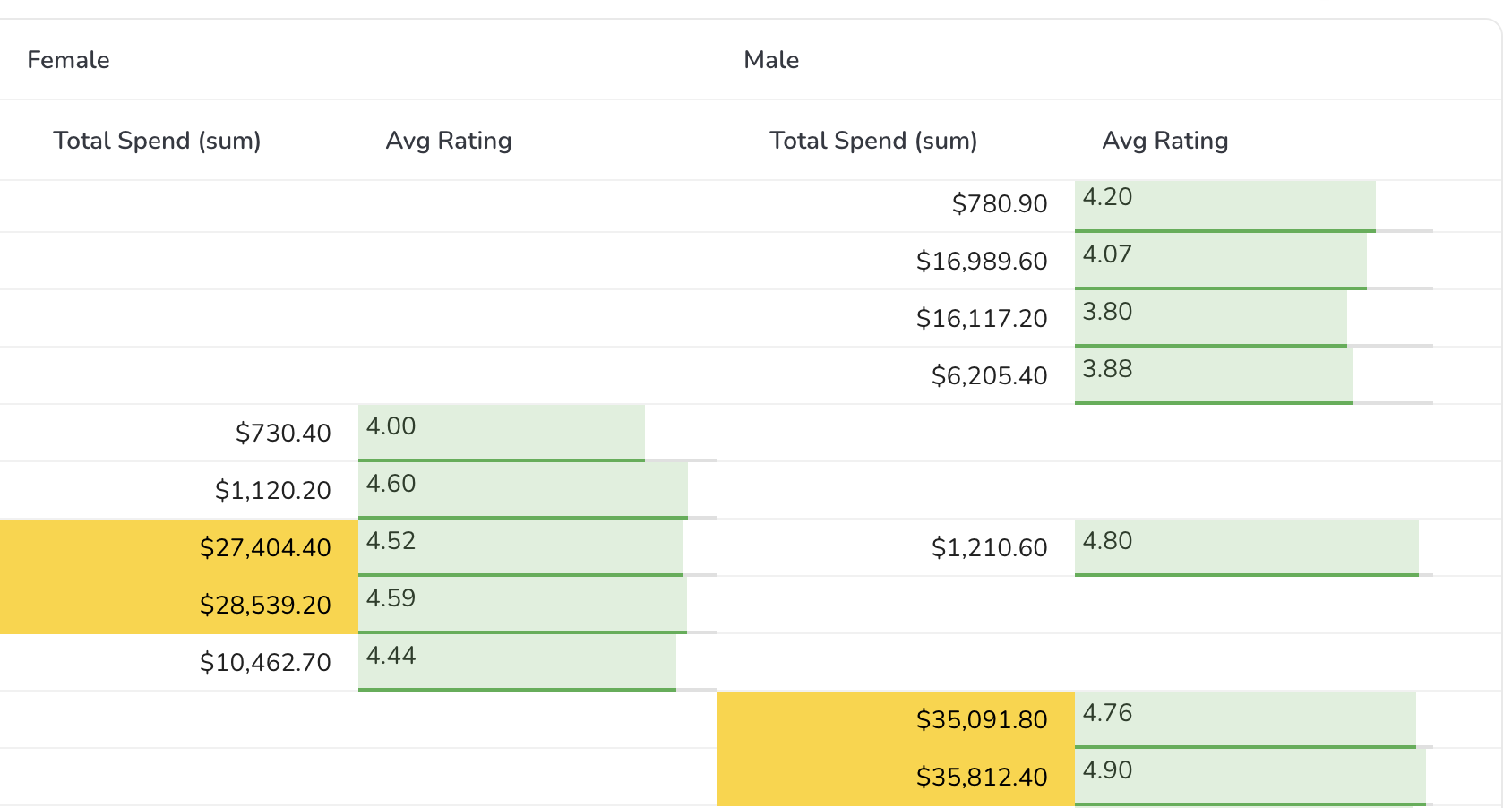
The pivot columns are generated based on the unique combinations of row, column, and value headers.
Each column represents a specific combination of values, and the values within each column are aggregated based on the value header.
Pivot Table also supports hierarchical structures, allowing for expanded and collapsed rows.
Summary Values
The Pivot supports summary values, calculated based on aggregations like sum, average, count, minimum, maximum, medium, etc. Also you can define your own summary values.
These summary values are customizable with different formats and text displays to fit your business requirements.
Flexible Sorting and Filtering
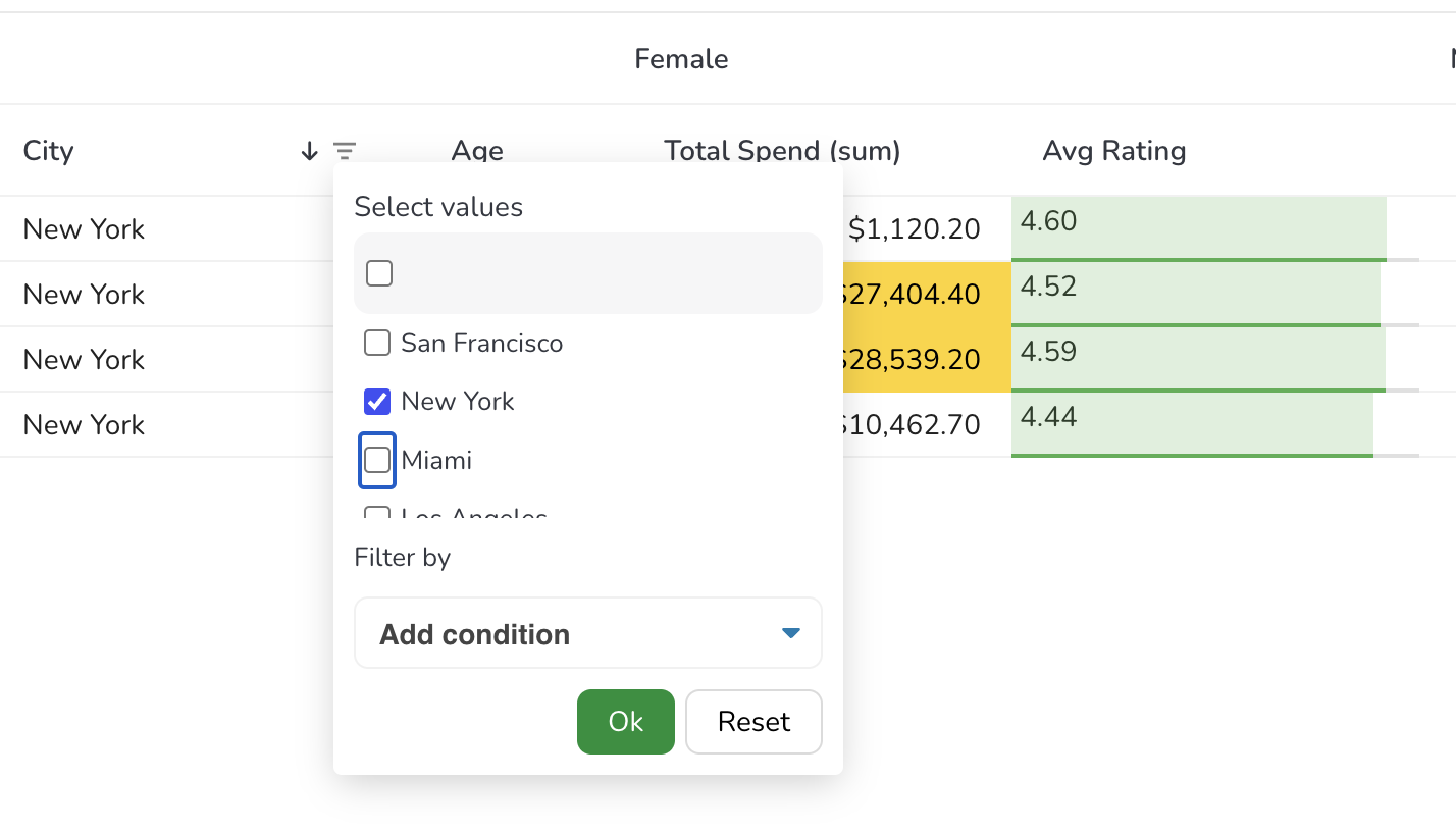
The plugin includes powerful sorting and filtering capabilities, allowing users to dynamically adjust their view of the data.
Sorting can be applied to individual fields, while filtering enables more granular control over the displayed data.
Configuration Management
The Configurator component allows users to easily manage and organize fields within the pivot grid.
Users can drag and drop fields into different areas such as rows, columns, or values, enabling fast customizations.
Dimensions can also be hidden or restricted to certain areas for a more controlled user experience.
Customizable Pivot Configurations
The PivotConfig provides an easy way to define the layout of rows, columns, and value fields.
The dimensions are fully customizable, allowing users to apply different aggregators and filters
to control data representation.
Example configuration:
1
constdefaultPivotConfig= ():PivotConfig=> ({
2
// Define the dimensions to choose from
3
dimensions: [
4
{
5
prop:'Age',
6
columnType:'integer',
7
filter: ['number'],
8
size:100,
9
sortable:true,
10
aggregators: {
11
sum: commonAggregators.sum,
12
avg: commonAggregators.avg,
13
},
14
},
15
{ prop:'City' },
16
{ prop:'Total Spend' },
17
],
18
// Define the rows
19
rows: ['Age'],
20
// Define the columns
21
columns: ['City'],
22
// Define the values: aggregations for your columns