
Spreadsheet status
Keep the defaults for range address, count, sum, average, min, and max.
SmartPanelPlugin adds a compact status surface that stays synchronized with
RevoGrid. It reads selection, focus, row visibility, tree/group nodes, pinned
viewports, checkbox row selection, formulas, and source changes from grid
providers instead of inspecting rendered DOM cells.
Use the defaults for spreadsheet-style selection statistics, or replace the complete item list with application-specific formulas and resolvers. The panel can sit directly below the grid or render into an application-owned host.
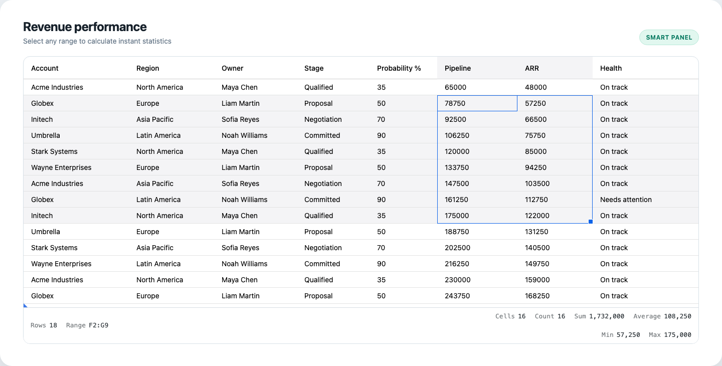
The default panel adds row context on the left and selection statistics on the right. Items appear only when their visibility conditions are met.
Install the plugin and enable range selection:
import { SmartPanelPlugin } from '@revolist/revogrid-pro';
const grid = document.querySelector<HTMLRevoGridElement>('revo-grid')!;
grid.range = true;grid.plugins = [SmartPanelPlugin];With no smartPanel configuration, the plugin creates a panel immediately
after <revo-grid>. It always shows the number of main data rows. When a range
contains more than one cell it can also show:
The panel refreshes after edits, source and column updates, filtering, sorting, trimming, pagination, row order, focus/range changes, multi-range changes, checkbox row selection, and tree-state changes. Bursts are coalesced before the provider snapshot is rebuilt.
Replace items to control exactly what appears:
grid.smartPanel = { locale: 'en-US', numberFormat: { maximumFractionDigits: 0, }, items: [ { id: 'rows', label: 'Rows', metric: 'visibleRows', align: 'left', }, { id: 'range', label: 'Range', metric: 'rangeAddress', align: 'left', visible: ({ snapshot }) => snapshot.selectedCells.length > 1, }, { id: 'revenue', label: 'Selected revenue', formula: '=SUM(SELECTION)', align: 'right', format: value => `$${Number(value).toLocaleString('en-US')}`, }, ],};Every item needs a stable id and one value source: metric, formula, or
resolve. If more than one is supplied, resolution uses resolve, then
formula, then metric.
| Metric | Result |
|---|---|
selectedCells | Unique selected cells across the active and multi-ranges |
selectedRows | Checkbox-selected rows when RowSelectPlugin is installed; otherwise rows represented by the cell range |
visibleSelectedRows | Selected rows that remain visible after trimming |
selectedColumns | Unique columns represented by the selected cells |
visibleRows / totalRows / hiddenRows | Main data-row counts; synthetic grouping rows are excluded |
visibleNodes / totalNodes | Main row-store nodes, including synthetic tree or grouping nodes |
focusedCell / focusedColumn | Current A1 address or column label |
rangeAddress | One or more A1 ranges, with pinned viewport ownership when needed |
numericCount, sum, average, min, max | Finite numeric values from selected cells |
distinct | Unique selected values |
Formula items use the same evaluator as RevoGrid formulas. Two dynamic names are available:
SELECTION — all values in the current item scopeVALUES — an equivalent alias that reads naturally for row/column formulasgrid.smartPanel = { items: [ { id: 'median', label: 'Median', formula: '=MEDIAN(SELECTION)' }, { id: 'spread', label: 'Spread', formula: '=MAX(VALUES)-MIN(VALUES)' }, { id: 'visible-arr', label: 'Visible ARR', formula: '=SUM(VALUES)', scope: 'visibleRows', column: 'arr', }, { id: 'all-arr', label: 'All ARR', formula: '=SUM(VALUES)', scope: 'allRows', column: 'arr', }, ],};scope defaults to selection. For visibleRows and allRows, set column
to evaluate one field. Without column, the panel flattens enumerable values
from every row in that scope.
Custom resolvers receive the complete provider-backed snapshot and may be synchronous or asynchronous:
grid.smartPanel = { className: 'operations-panel', items: [ { id: 'visibility', label: 'Visible accounts', align: 'left', resolve: ({ snapshot }) => `${snapshot.visibleRowCount} of ${snapshot.totalRowCount}`, }, { id: 'regions', label: 'Regions', align: 'center', resolve: ({ snapshot }) => new Set(snapshot.visibleRows.map(row => row.region)).size, }, { id: 'pipeline', label: 'Pipeline', scope: 'visibleRows', column: 'pipeline', formula: '=SUM(VALUES)', align: 'right', format: value => `$${Number(value).toLocaleString('en-US')}`, }, { id: 'health', label: 'Health', align: 'right', resolve: ({ snapshot }) => snapshot.visibleRows.every(row => row.health === 'On track') ? 'On track' : 'Needs attention', className: 'operations-panel__health', }, ],};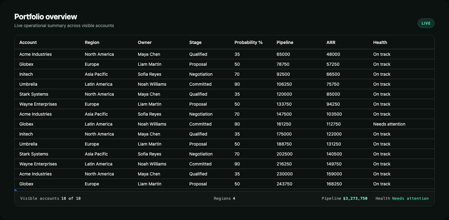
Formula items and application resolvers can share the same left, center, and right aligned panel.
The resolver context contains:
| Field | Description |
|---|---|
grid | Host HTMLRevoGridElement |
providers | RevoGrid plugin providers for advanced integrations |
snapshot | One immutable-by-convention snapshot shared by every item in the refresh |
item | Current item configuration |
values | Values resolved from the item’s scope and optional column |
snapshot includes ranges, selected cells and raw/evaluated values, checkbox
and range rows, selected columns, visible/all main rows, visible/all rows across
pinned stores, data-row and node counts, focus metadata, and a revision number.
| Property | Default | Purpose |
|---|---|---|
label | none | Muted text before the value |
align | right | Places the item in the left, center, or right group |
order | declaration index | Orders items inside an alignment group |
priority | 0 | Secondary sort and a data-priority styling hook |
visible | true | Boolean or snapshot predicate controlling whether the item renders |
format | panel formatter | Converts the resolved value into display text |
render | none | Returns a safe Node or text string for custom presentation |
className | none | Adds an application class to the item |
title | none | Static string or context callback for the native title |
Strings returned from render or a resolver are inserted as text, never as raw
HTML. Return a DOM Node when richer content is required:
{ id: 'status', render: value => { const badge = document.createElement('strong'); badge.className = 'status-badge'; badge.textContent = String(value); return badge; }, resolve: ({ snapshot }) => snapshot.hiddenRowCount ? 'Filtered' : 'Complete',}Pass an element or a callback when layout belongs to the application:
<div class="grid-layout"> <revo-grid id="accounts"></revo-grid> <aside id="grid-insights"></aside></div>grid.smartPanel = { host: () => document.querySelector('#grid-insights'), items,};grid.plugins = [SmartPanelPlugin];The plugin never removes a user-owned host. Assign a new smartPanel object or
call plugin.setHost(nextHost) to move the existing component. Passing null
returns it to a plugin-owned host immediately after the grid.
| Property | Default | Description |
|---|---|---|
host | panel after grid | Element or callback providing the panel container |
items | spreadsheet defaults | Complete ordered item configuration |
className | none | Additional class on the panel host |
ariaLabel | Grid summary | Accessible name for the status region |
hiddenWhenEmpty | false | Hides the host when no configured items resolve visibly |
locale | browser locale | Locale passed to Intl.NumberFormat |
numberFormat | { maximumFractionDigits: 2 } | Default numeric formatting options |
formatValue | built-in formatter | Panel-wide value formatter used before item-level format |
onError | none | Receives an isolated item/formula error |
schedule | microtask | Use animationFrame to align refreshes with visual frame updates |
Assign false to hide the installed panel without removing the plugin:
grid.smartPanel = false;Direct property assignments are observable. The legacy
additionalData.smartPanel configuration remains available for compatibility,
but new integrations should use grid.smartPanel.
Retrieve the plugin instance through RevoGrid’s plugin service:
const smartPanel = (await grid.getPlugins()) .find(plugin => plugin instanceof SmartPanelPlugin);
const snapshot = smartPanel?.getSnapshot();const items = smartPanel?.getItems();await smartPanel?.refresh();smartPanel?.setHost(document.querySelector('#grid-insights'));| Method | Purpose |
|---|---|
getSnapshot() | Returns the last committed provider snapshot |
getItems() | Returns a copy of the last resolved item list |
getComponent() | Returns the presentation-only SmartPanelComponent |
refresh() | Immediately rebuilds and renders the snapshot; resolves when committed |
setHost(host) | Moves the panel to a user host or back to an owned host with null |
| Event | Detail | Purpose |
|---|---|---|
smartpanelchange | { snapshot, items } | Fires after the latest asynchronous refresh commits |
smartpanelerror | { error, item } | Reports one failed item while healthy items continue rendering |
When async item resolvers overlap, only the newest refresh commits. Use
onError or smartpanelerror for telemetry without taking down the rest of
the panel.
The Pro stylesheet includes responsive wrapping at 720px. Customize the
panel through its public variables and stable classes:
.operations-panel { --revo-smart-panel-background: #101615; --revo-smart-panel-color: #d7e2de; --revo-smart-panel-border: #2a3834; --revo-smart-panel-gap: 24px;
border-radius: 12px;
&__health .revo-smart-panel__value { color: #32d89b; }}| Selector | Role |
|---|---|
.revo-smart-panel | Host status region |
.revo-smart-panel__group--left | Left item group |
.revo-smart-panel__group--center | Center item group |
.revo-smart-panel__group--right | Right item group |
.revo-smart-panel__item | One resolved item |
.revo-smart-panel__label | Item label |
.revo-smart-panel__value | Text or custom rendered value |
Spreadsheet status
Keep the defaults for range address, count, sum, average, min, and max.
Filtered data status
Combine visible/total row metrics with formulas scoped to visibleRows.
Tree and grouping
Use node metrics beside data-row metrics to distinguish structural rows.
Application insights
Mount into a dashboard shell and add async resolvers or custom Nodes.
The component uses role="status", aria-live="polite", and the configured
accessible label. Keep item labels concise so selection gestures do not create
overly verbose screen-reader announcements.